In the previous two posts, we discussed about IGRAPH object and how to manipulate, measure and cluster it. In this final post of network analysis series, I will focus on the network work visualization.
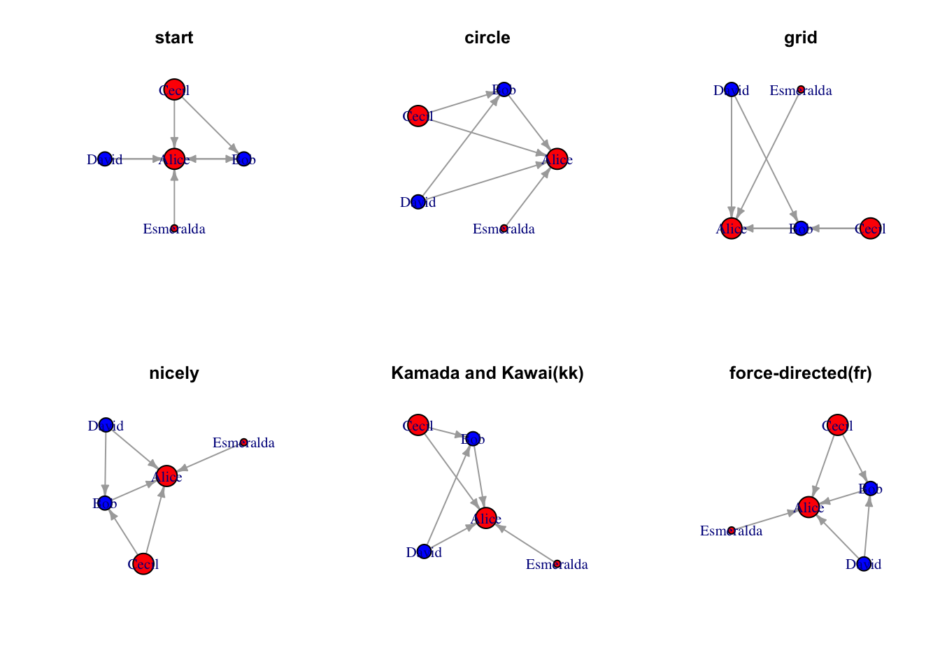
Network visualization are supported by two aspects — the aesthetics of network elements (aka, vertices and edges) and layout of network. There are multiple packages available for these aspects. I will focus on the basic igraph plot which is base R plot and the application of ggraph which use similar syntax comparable to ggplot2.
Aesthetics of network elements
The aesthetics of both vertices and edges can be manipulated at color, transparency. Specially for vertices, we can also manipulate its shape, size and fill. For edges, we can manipulate its width/thickness, linetype, arrow and so on. Here, use simple example “actors” to show you how to present aesthetics using igraph default plot and ggraph
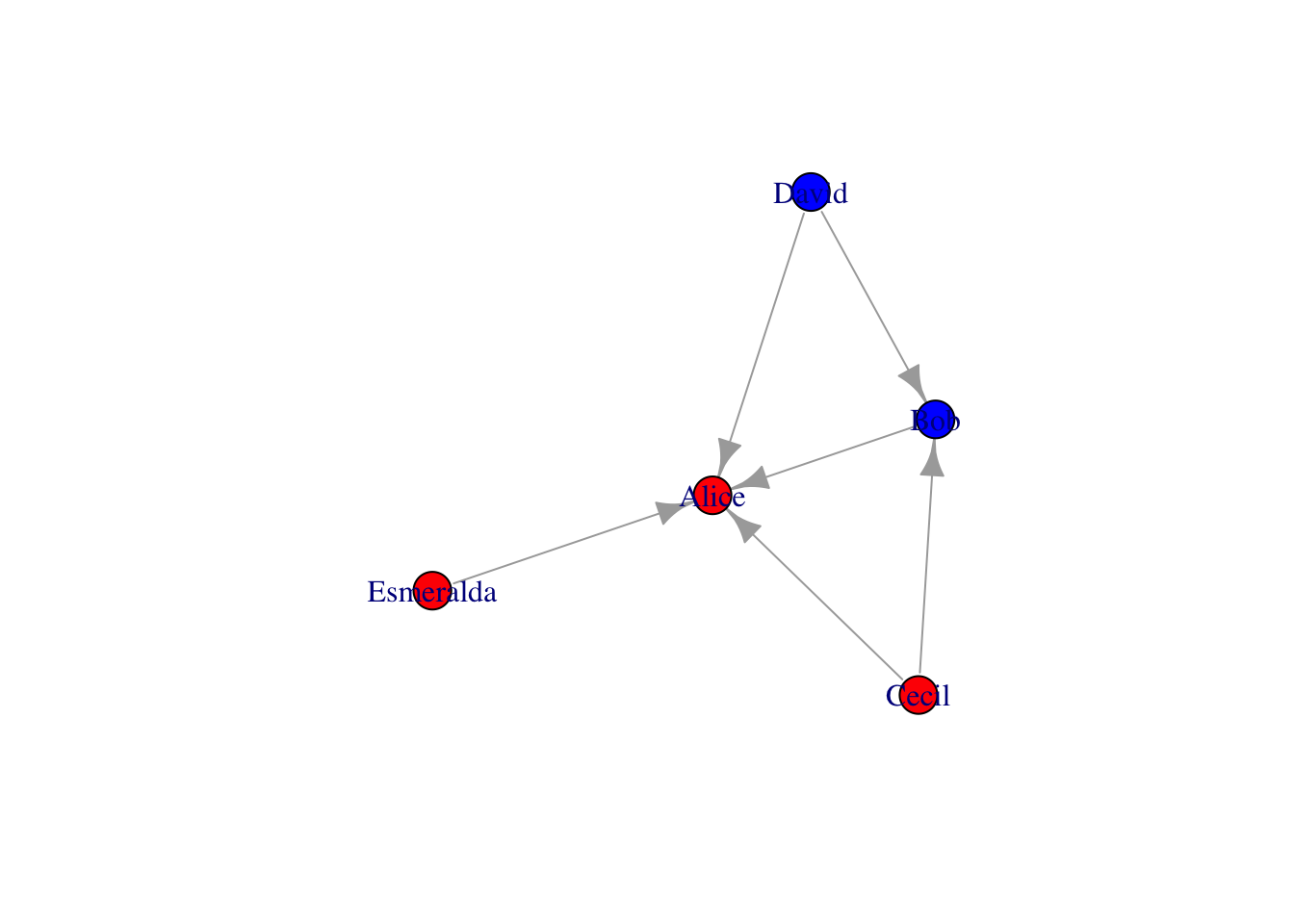
# make female and male color differentv =as_data_frame(g, what="vertice") %>% as_tibble %>%mutate(color=case_when(gender=="F"~"red", gender=="M"~"blue"))g = g %>%set_vertex_attr("color", value=v$color)plot(g)
Code
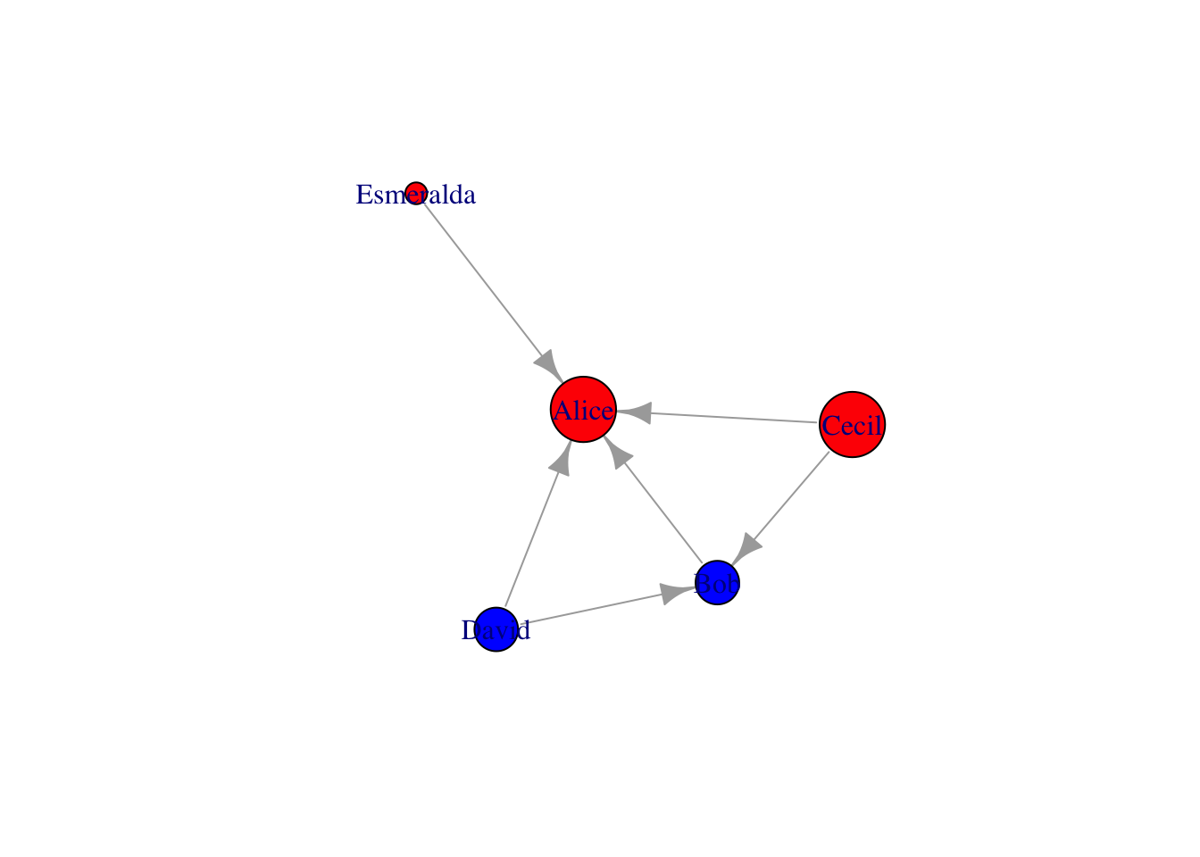
# make age as sizev = v %>%mutate(size=case_when(age <30~10, age <40& age >30~20, age >40~30))g = g %>%set_vertex_attr("size", value=v$size)plot(g)
The methods mentioned above can also be done by specify in plot(). One quick example below show the shape aesthetics. Check igraph valid shape names by names(igraph:::.igraph.shapes)
Code
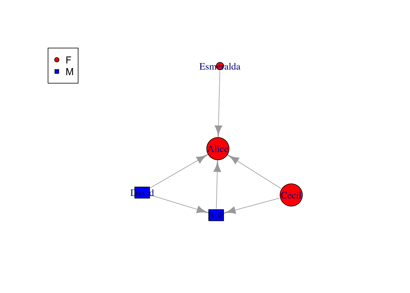
# make gender as shapev = v %>%mutate(shape=case_when(gender=="F"~"circle", gender=="M"~"rectangle"))plot(g, vertex.shape=v$shape)legend('topleft',legend=unique(v$gender),pch=c(21, 22),pt.bg=c("red","blue"))
Be aware that the aesthetics specified by attributes can be overwritten by specifying in plot(). In addition, those aesthetics can also be used to apply to all vertices like plot(g, vertex.shape="rectangle"). The attributes to be manipulated in igraph (using base R) are limited. To find all the plotting attributes, try ?plot.igraph or go to https://igraph.org/r/doc/plot.common.html
We can also draw attention to certain nodes by mark.groups in plot
Code
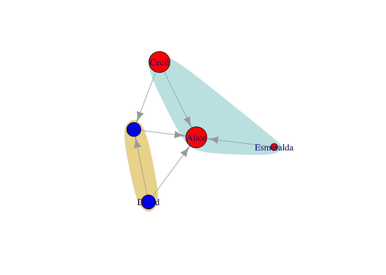
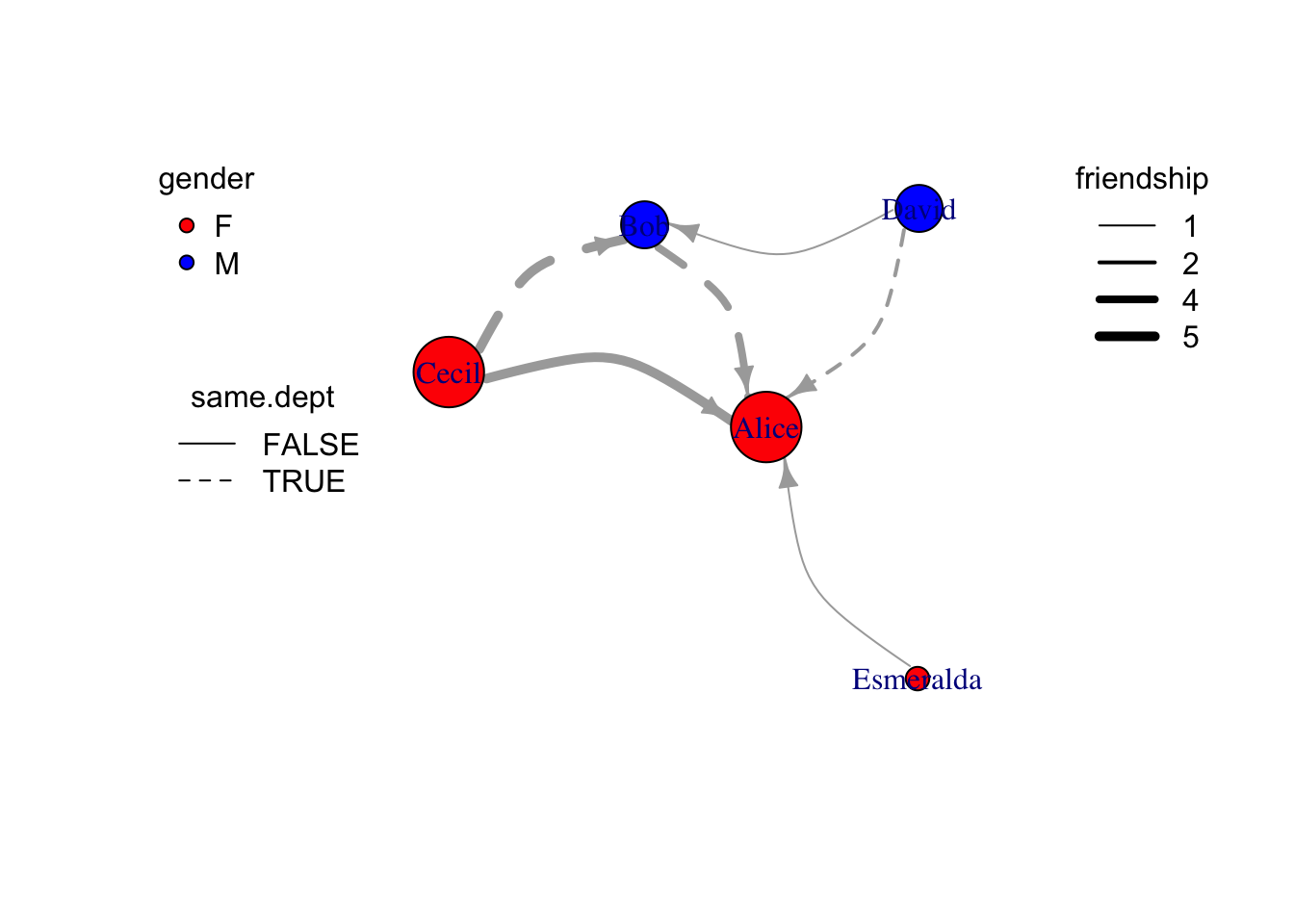
# mark deptg = g %>%set_vertex_attr("dept",value=c("sale","IT","sale","IT","sale")) %>%set_edge_attr("same.dept",value=c(F,F,T,F,T,T))v =as_data_frame(g, "vertices")plot(g, mark.groups=list(unlist(v %>%filter(dept=="sale") %>%select(name)),unlist(v %>%filter(dept=="IT") %>%select(name)) ), mark.col=c("#C5E5E7","#ECD89A"), mark.border=NA)
ggraph is a ggplot version of graph plotting. Using graph object as input, it can convert vertice attributes to plot attribute automatically or manually.
Code
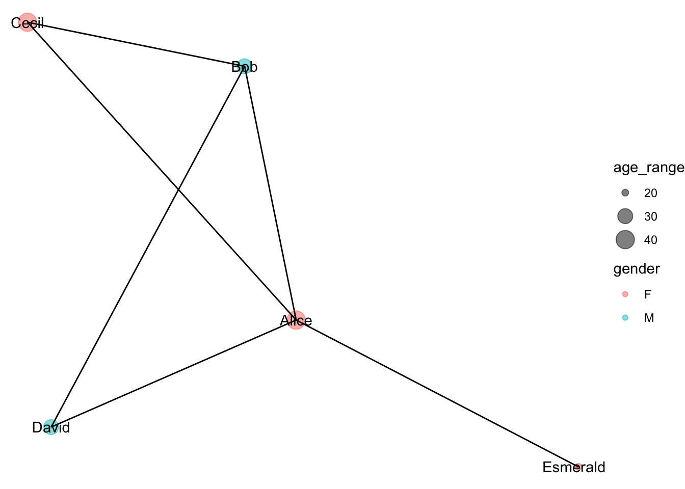
v = v %>%mutate(age_range=case_when(age <30~20, age <40& age >30~30, age >40~40))g = g %>%set_vertex_attr("age_range", value=v$age_range)ggraph(g, layout ="kk") +geom_node_point(aes(size=age_range, color=gender), alpha=0.5) +geom_node_text(aes(label=name)) +geom_edge_link() +scale_size_continuous(breaks=c(20,30,40), range =c(2, 6)) +theme_void()
Almost all the {ggplots} theme, scale functions are available for {ggraph}. Refer to rdocumentation for more details.
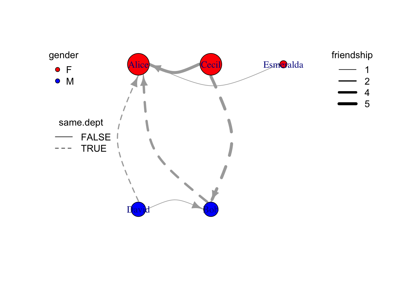
Edge aesthetics
Similar to vertex aesthetics, edge plotting aesthetics can be manipulated both {igraph} default plotting and {ggraph} plotting
Code
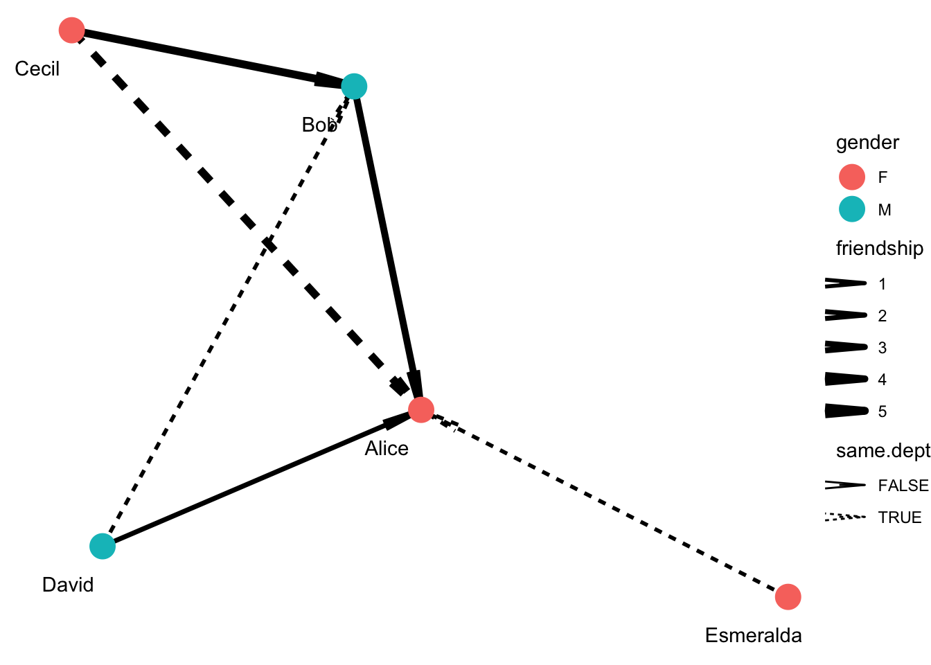
# use linetype present whether come from same department, and line width presents friendshipe =as_data_frame(g, what="edges") %>% as_tibble %>%mutate(width=friendship) %>%mutate(lty=ifelse(same.dept,1,2))plot( g %>%set_edge_attr("width",value=e$width) %>%set_edge_attr("lty",value=e$lty),edge.arrow.size=0.8,edge.curved=T)legend("topleft", legend=unique(v$gender),pch=21,pt.bg=c("red","blue"), title="gender", box.lty=0)legend("left",legend=unique(e$same.dept),lty=c(1,2), title ="same.dept",box.lty=0)legend("topright", legend=sort(unique(e$friendship)), lwd=sort(unique(e$friendship)), title="friendship", box.lty=0)
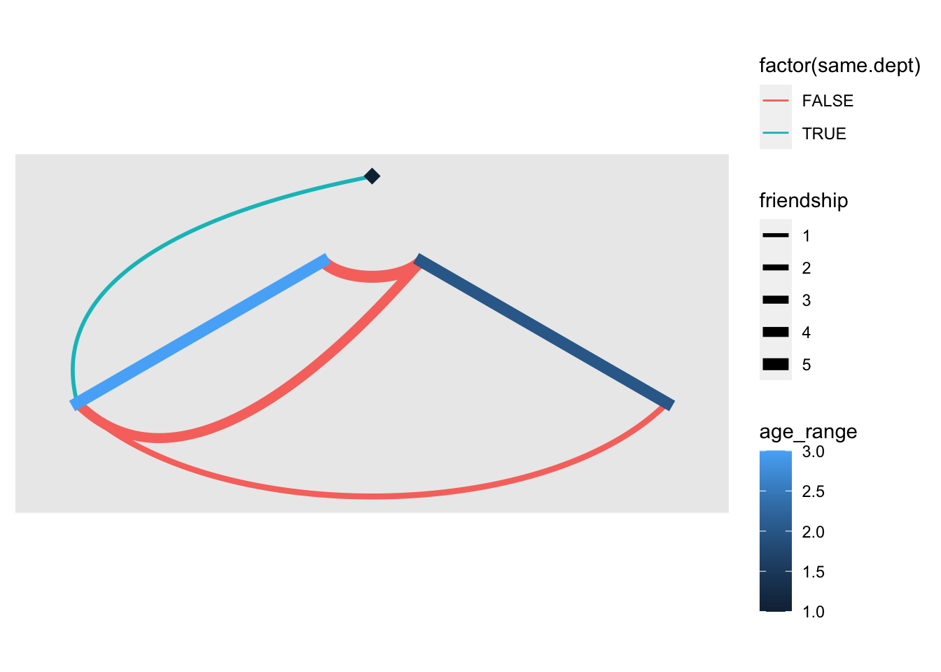
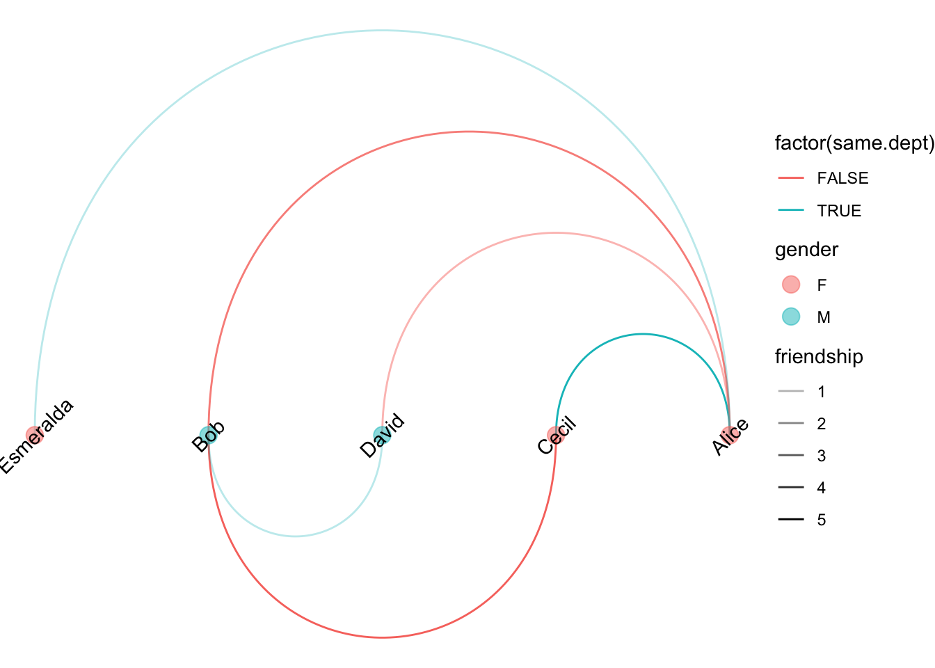
Using {ggraph} to show edges attribute is much easier.
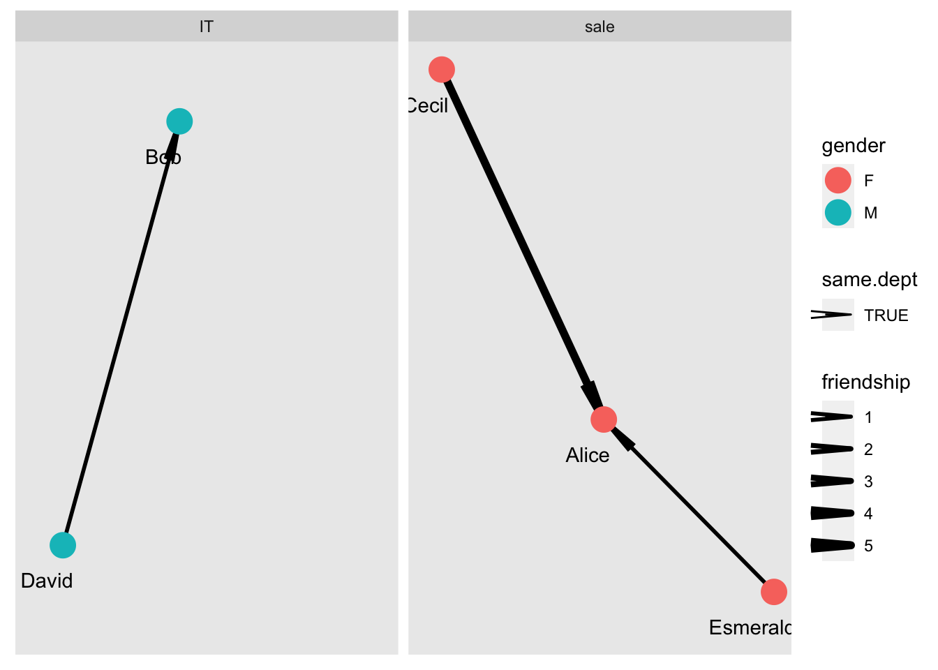
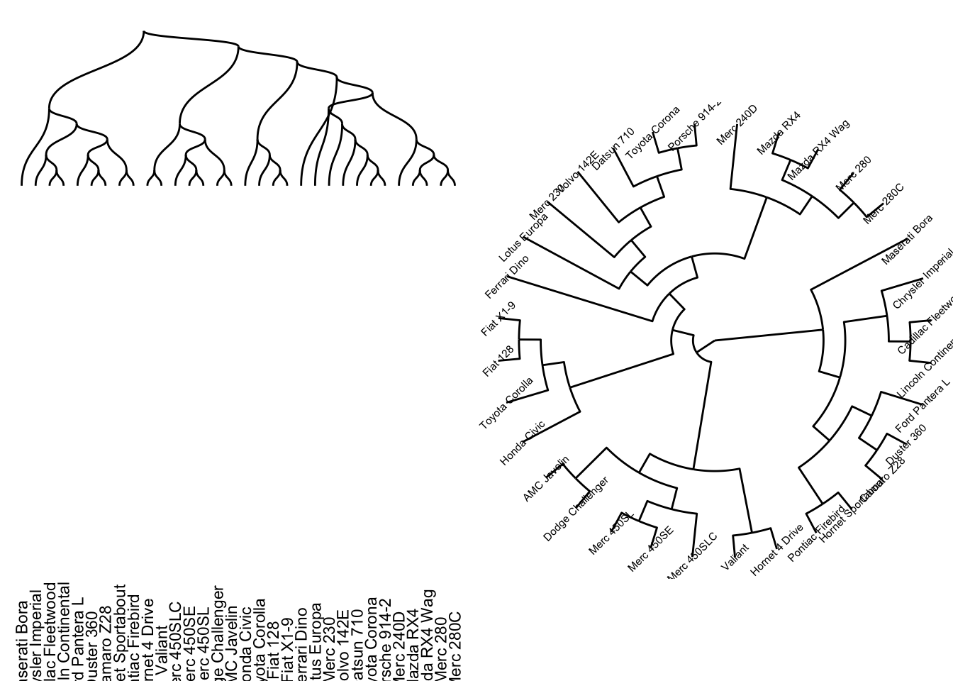
Hierarchical layouts can plot data in layer. Here show example how to use sugiyama layout
Code
# make different dept nodes at different nodeg = g %>%set_vertex_attr("dept",value=c("sale","IT","sale","IT","sale")) %>%set_edge_attr("same.dept",value=c(F,F,T,F,T,T))v =as_data_frame(g, "vertices") %>% as_tibble %>%mutate(layer=ifelse(dept=="sale",1,2))e =as_data_frame(g, what="edges") %>% as_tibble %>%mutate(width=friendship) %>%mutate(lty=ifelse(same.dept,1,2))g = g %>%set_edge_attr("width",value=e$width) %>%set_edge_attr("lty",value=e$lty)lay1 <-layout_with_sugiyama(g, layers=v$layer, attributes="all")plot(lay1$extd_graph, edge.curved=T)legend("topleft", legend=unique(v$gender),pch=21,pt.bg=c("red","blue"), title="gender", box.lty=0)legend("left",legend=unique(e$same.dept),lty=c(1,2), title ="same.dept",box.lty=0)legend("topright", legend=sort(unique(e$friendship)), lwd=sort(unique(e$friendship)), title="friendship", box.lty=0)
ggraph can use all the layout mentioned above by specifying it in ggraph(g, layout=...). Besides, ggraph has addtional useful layout.
dendrogram: dendrogram layout not only take in graph object but also dendrogram object (as.dendrogram(hclust(dist(...)))). ggraph will automatically convert dendrogram to igraph by den_to_igraph. It ususally plots using geom_edge_diagonal() or geom_edge_elbow()
More functions about ggraph refer to https://www.rdocumentation.org/packages/ggraph/versions/1.0.2
other packages for graph visualization
There are many other packages available for graph visualization and network analysis. In this series, I will only list the link here for the further reference. I may come back to further this topic in the future when necessary.